Work / 2026

UltimaCards

A Shopify storefront for a Canadian trading card shop, built out of twelve custom sections that sell sealed product, singles, graded cards and a buylist from one homepage.

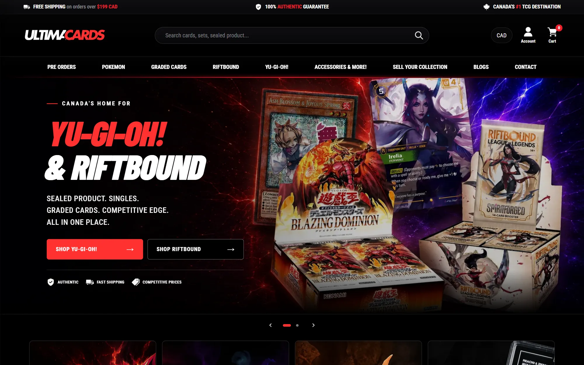
The Ultima Cards hero, with the shop's search bar and category navigation above a “Canada's home for Yu-Gi-Oh! & Riftbound” banner
Client
Ultima Cards, Canada
Year
2026
Services
Web design, E-commerce, Front-end development
/01

The challenge

Ultima sells to three kinds of customer at once. Competitive players want a specific single for a deck, today. Collectors want sealed boxes and graded slabs, and want to trust that they are real. And a steady stream of people want to sell their cards rather than buy them. A stock Shopify theme treats all of that as one product grid, which buries the pre-orders that drive the calendar, the graded stock that carries the margin and the buylist that keeps inventory coming in. The shop also covers several games, each with its own fans who expect to find their game first.
/02

The approach

We kept Shopify's Impact theme for what it does well — cart, search, checkout, filtering — and built the storefront on top of it as twelve custom sections, each doing one job: a game-by-game hero, a category grid that splits every game into singles and sealed, a weekly spotlight, a pre-order countdown, new arrivals filtered by game, a GradedGuard promotion, a buylist banner, and reviews with an FAQ. Because they are Shopify sections, the shop can reorder them, swap the featured game or retarget the countdown from the theme editor without touching code. The look borrows from the games themselves: black, a single hard red, condensed italic type and plenty of card art.

/03

The outcome

ultimacards.ca now opens on the game a visitor came for and gets them to singles or sealed product in one click. Pre-orders count down on the homepage, graded cases have their own storefront band, and selling a collection is a three-step path that starts from the main navigation. The team runs the calendar from the theme editor: a new release is a change to one section, not a redesign.

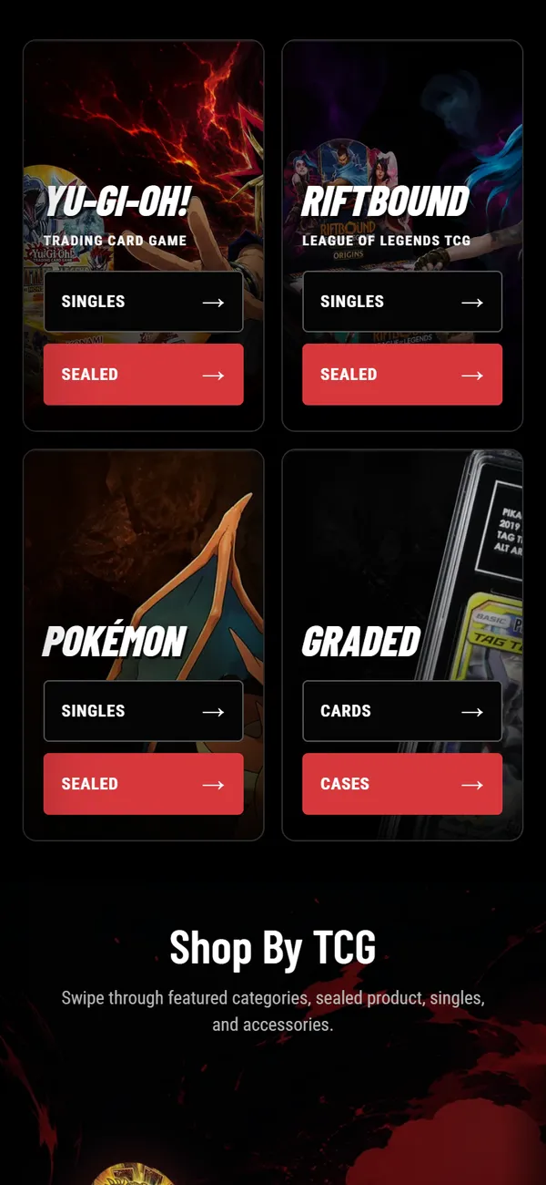
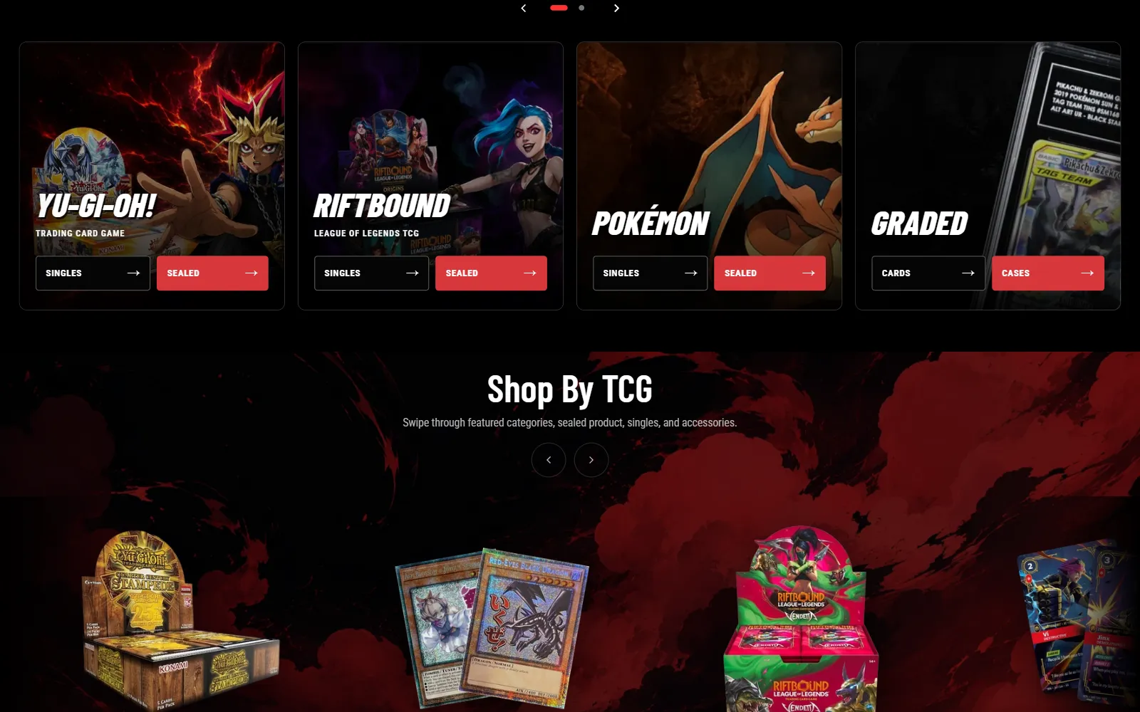
The category grid: Yu-Gi-Oh!, Riftbound, Pokémon and Graded tiles, each with Singles and Sealed buttons, above the “Shop by TCG” slider
Every game gets a tile, and every tile splits in two. Singles or sealed is the first decision a card player makes, so it is the first thing the homepage asks.

Built for three kinds of customer

Players, collectors and sellers do not overlap much, so the homepage is built as a sequence rather than a grid: the game first, then what is hot this week, then what is coming, then what just landed, then protection for what you already own, then an offer for what you want to sell. Anyone can stop scrolling at the section that is theirs, and the navigation carries the same split for people who arrive knowing exactly what they want.

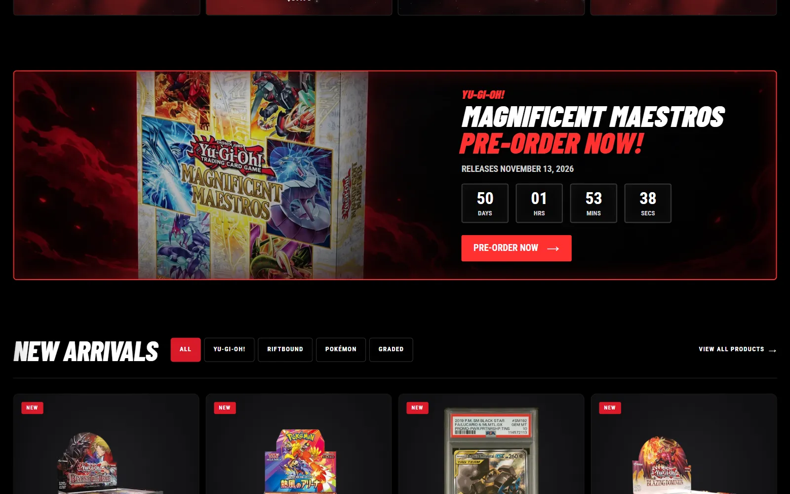
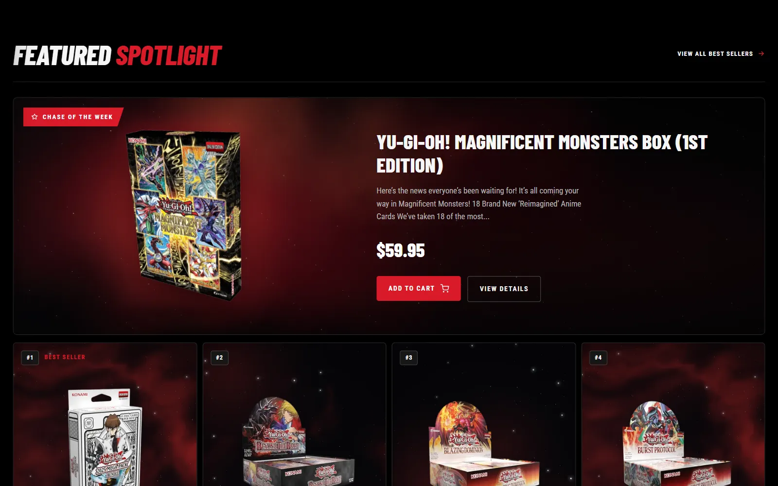
The Featured Spotlight section: a “Chase of the week” product card above a numbered row of best sellersA pre-order banner for Magnificent Maestros with a live days, hours, minutes and seconds countdown, above the New Arrivals filters
The weekly spotlight and the pre-order countdown. Release dates are the shop's calendar, so the next one is always counting down on the homepage.
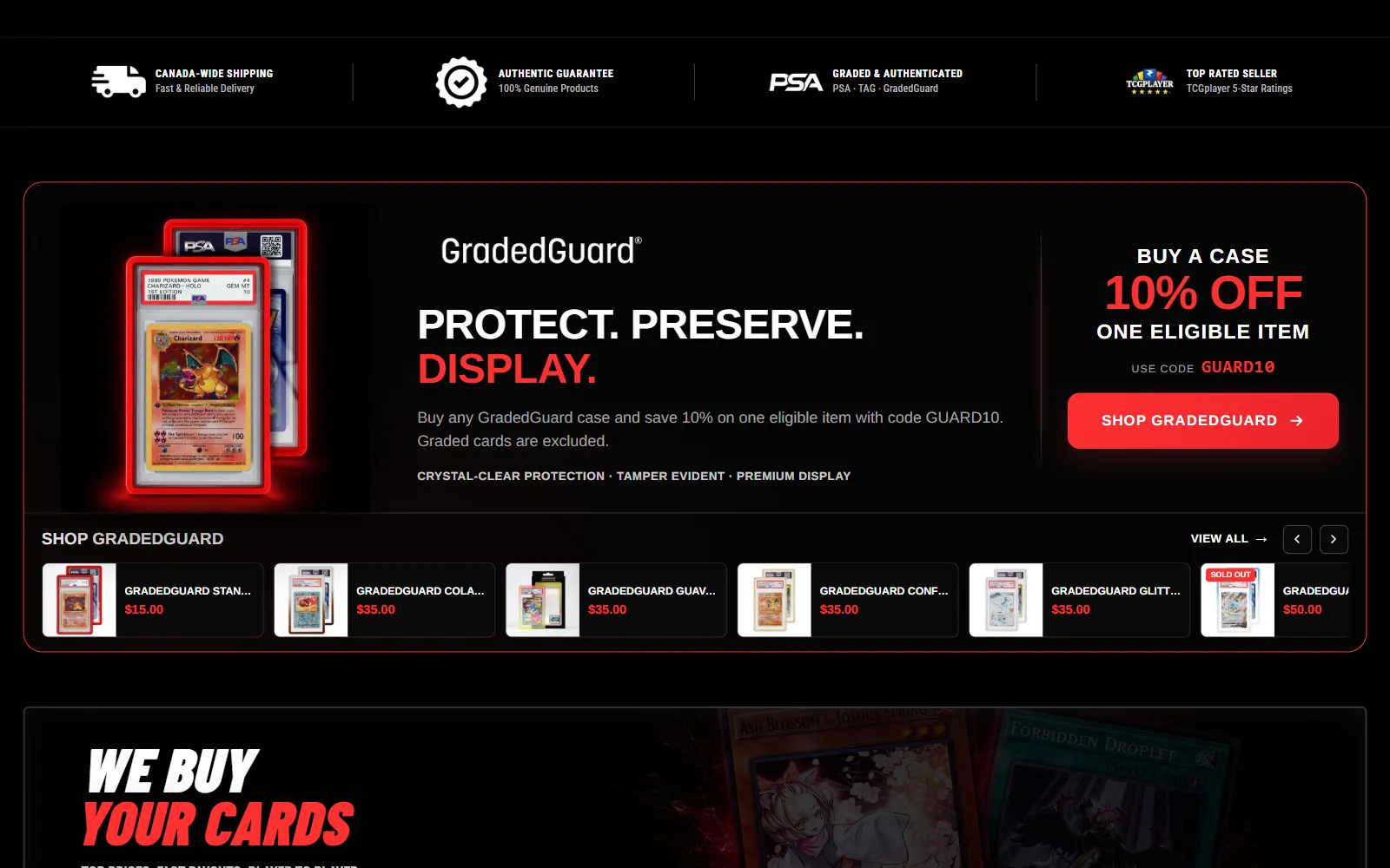
The GradedGuard promotion: a PSA slab in a red-lit case, a 10% offer and a scrolling strip of GradedGuard cases

A shop inside the shop

GradedGuard cases sell to people who have already bought something valuable. They get their own band with the offer, the code and a horizontal strip of every case with its price, so it works like a small shop you can browse without leaving the homepage.

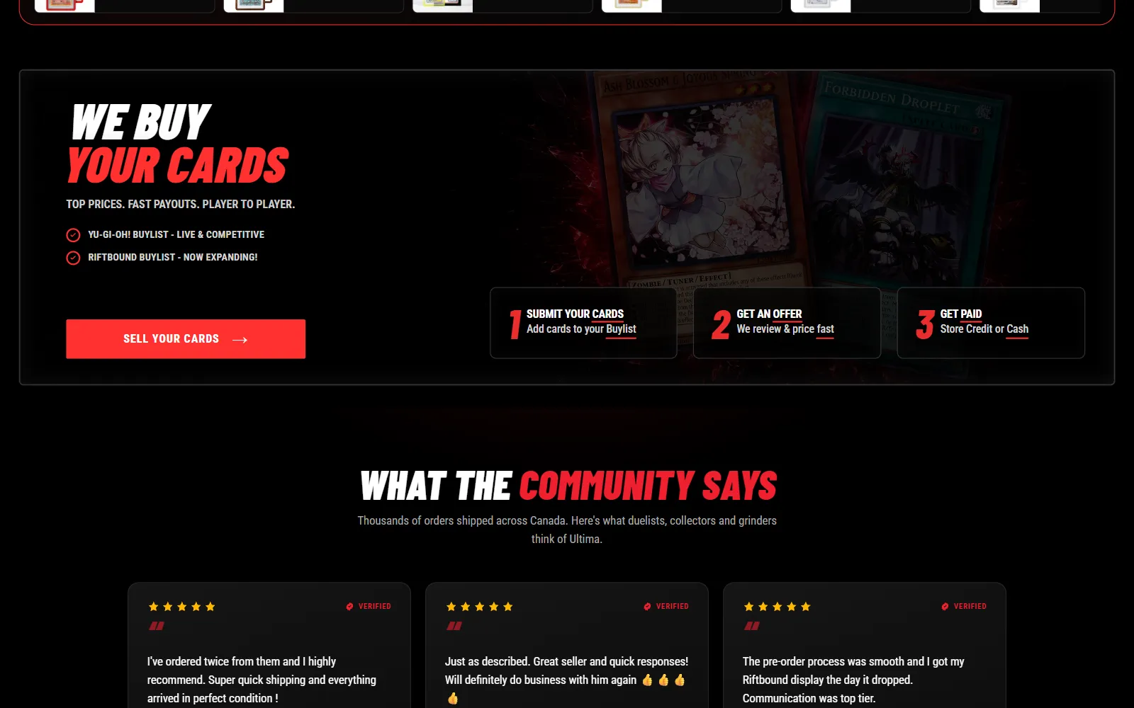
The “We buy your cards” banner: submit your cards, get an offer, get paid, with a link to the buylist

The other side of the counter

Buying collections is how a card shop stocks singles, so the buylist is not hidden in the footer. It gets a banner that fits the whole deal into three steps — submit, get an offer, get paid — and a page of its own in the main navigation.

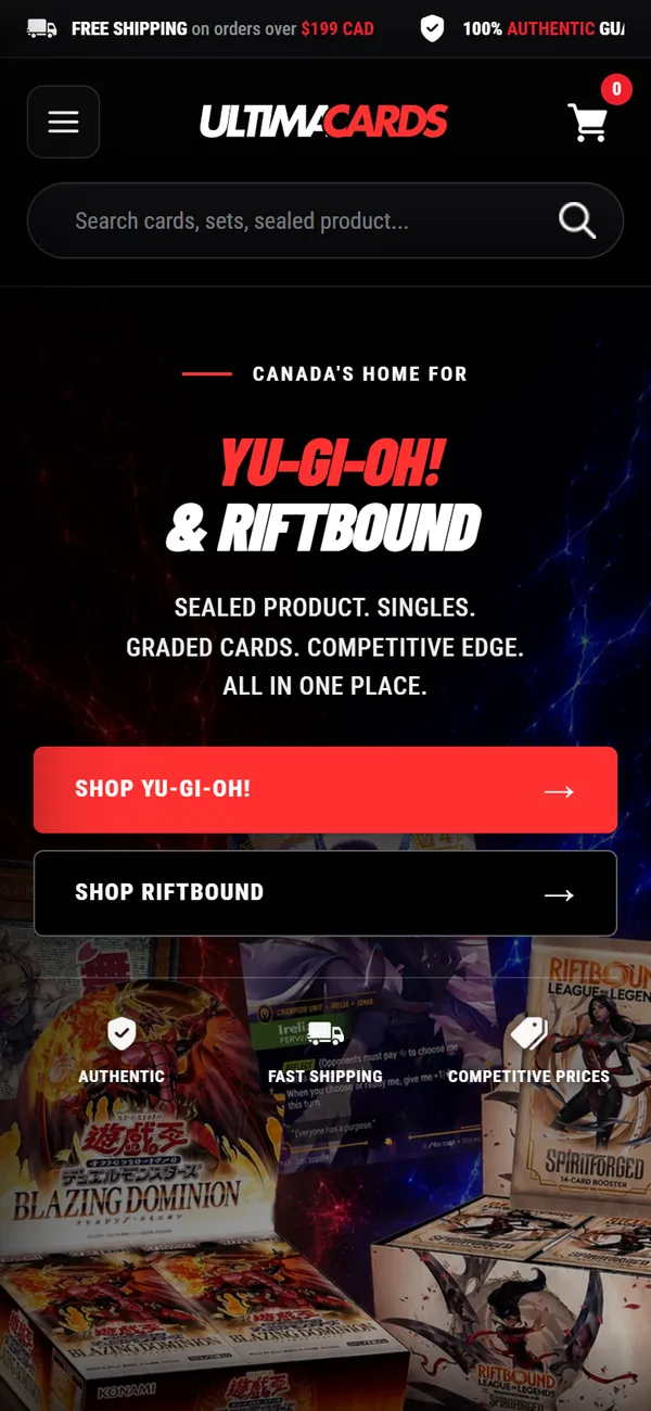
The Ultima Cards homepage on a phone: search bar, the Yu-Gi-Oh! and Riftbound headline, and two full-width shop buttonsThe category grid on a phone, as two columns of game tiles with Singles and Sealed buttons
On a phone the search bar sits above everything else, because most visits start with a card name.
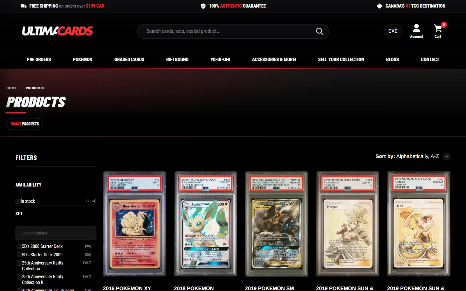
The all-products collection page: filters for availability and set beside a grid of graded Pokémon cards
Collection pages keep the theme's filtering and add the store's own header, so a two-thousand-item catalogue stays searchable by set.
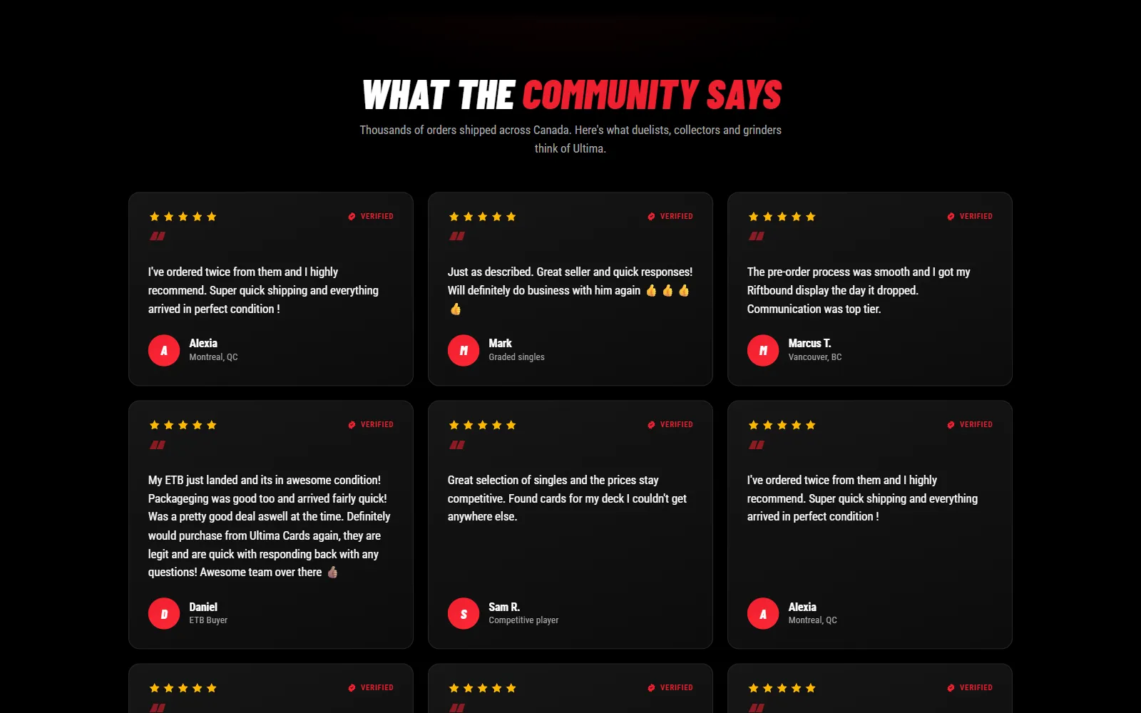
“What the community says”: a grid of verified customer reviews from across Canada
Trust is the whole business when the product is a rare card, so reviews from real buyers get a full section and the FAQ answers the authenticity question directly.
12
custom Shopify sections, all editable from the theme editor
4
product lines — three games and graded — each one click from the homepage
2,000+
in-stock items, filterable by set
3
steps from the navigation to a buylist offer

Next project

Groupe ADF

A bilingual site for a Montréal mortgage broker, hand-written and built around two calculators that do real Canadian mortgage math.